From Wireframes to Launch in 2 Weeks: Designing Video Registration
An early-stage hiring platform needed to register users through: recording a video, reviewing it, and then sign up with additional profile information. The team had wireframes, but they were fragmented. I had 2 weeks to make this feel intuitive, not overwhelming.
ROLE
UX/UI Designer (solo)
July to August 2024
2 weeks
2 weeks
SHIPPED
Launched August 2024
IMPACT
Redesigned the full post-registration system in 2025

The Problem
Fragmented Wireframes, No Guiding Hand
The existing wireframes had structure but lacked clarity
Users didn't know why they were recording a video
Users didn't know why they were recording a video
Users didn't know what to say
Users didn't know what to say
Users had no opportunity to review or redo their video
Users had no opportunity to review or redo their video
The flow jumped abruptly from recording to sign-up
The flow jumped abruptly from recording to sign-up
My Approach
Align First, Design Second
I spent week 1 aligning with the founder on three questions:
What does the platform actually need from this video?
What does the platform actually need from this video?
What would make a user feel confident recording?
What would make a user feel confident recording?
Where do users get stuck or abandoned?
Where do users get stuck or abandoned?
His answer was clear


The Flow I Designed
Informative Recording to Signup
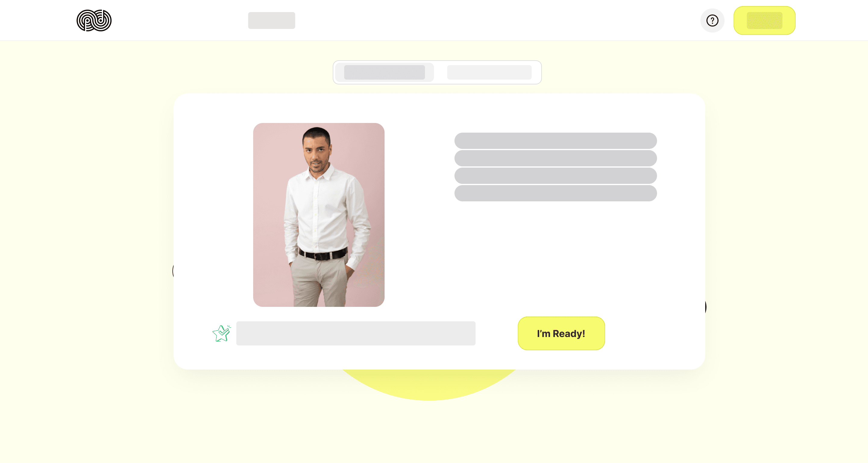
The Pitch
"Why do I need to record a video?"
I designed an informational pop-up that explained:
Why the platform needs this
What happens with the video
Why it matters
This step removes the "why am I doing this?" friction before it starts.
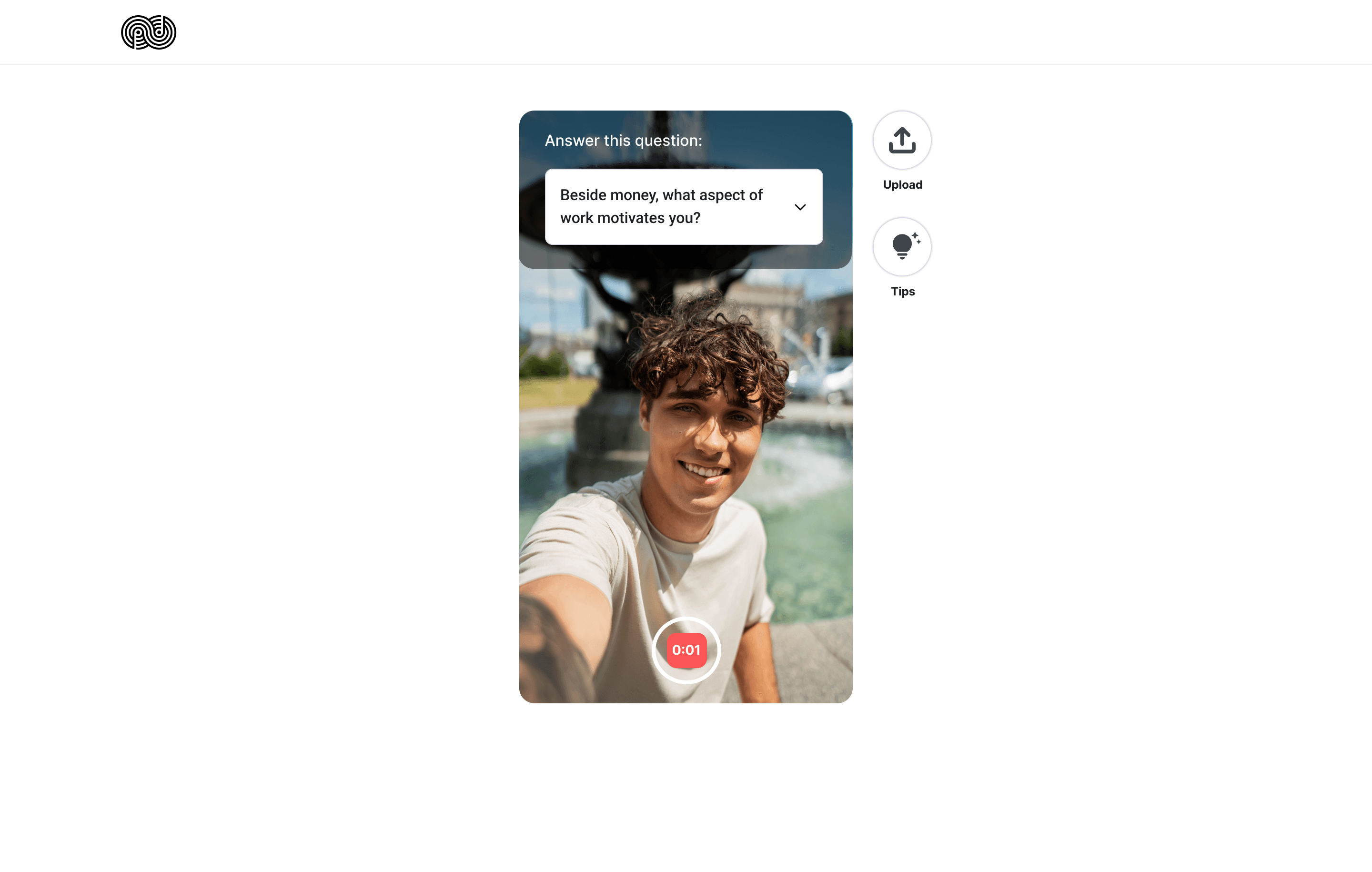
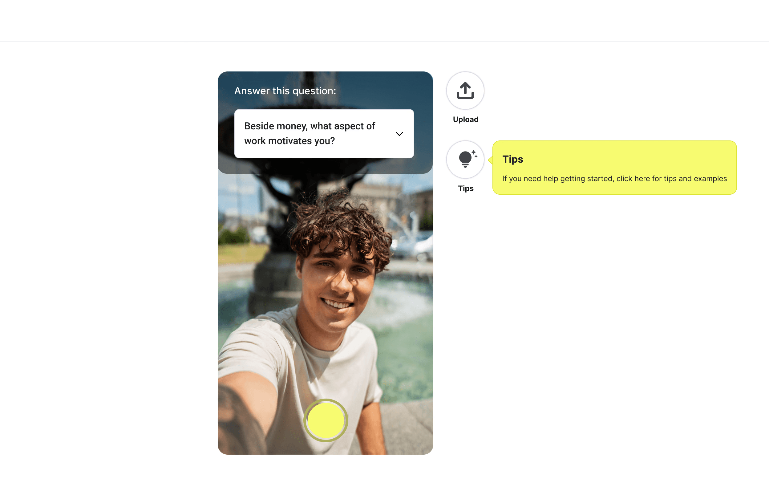
The Recording Interface
Is it recording? How much time do I have?
The interface showed:
Large camera preview (they can see themselves)
Clear timer, record/stop buttons
Buttons for video tops and example video
The Pitch
I designed an informational pop-up that explained:
Why the platform needs this
What happens with the video
Why it matters
This step removes the "why am I doing this?" friction before it starts.
The Recording Interface
The interface showed:
Large camera preview (they can see themselves)
Clear timer, record/stop buttons
Buttons for video tops and example video

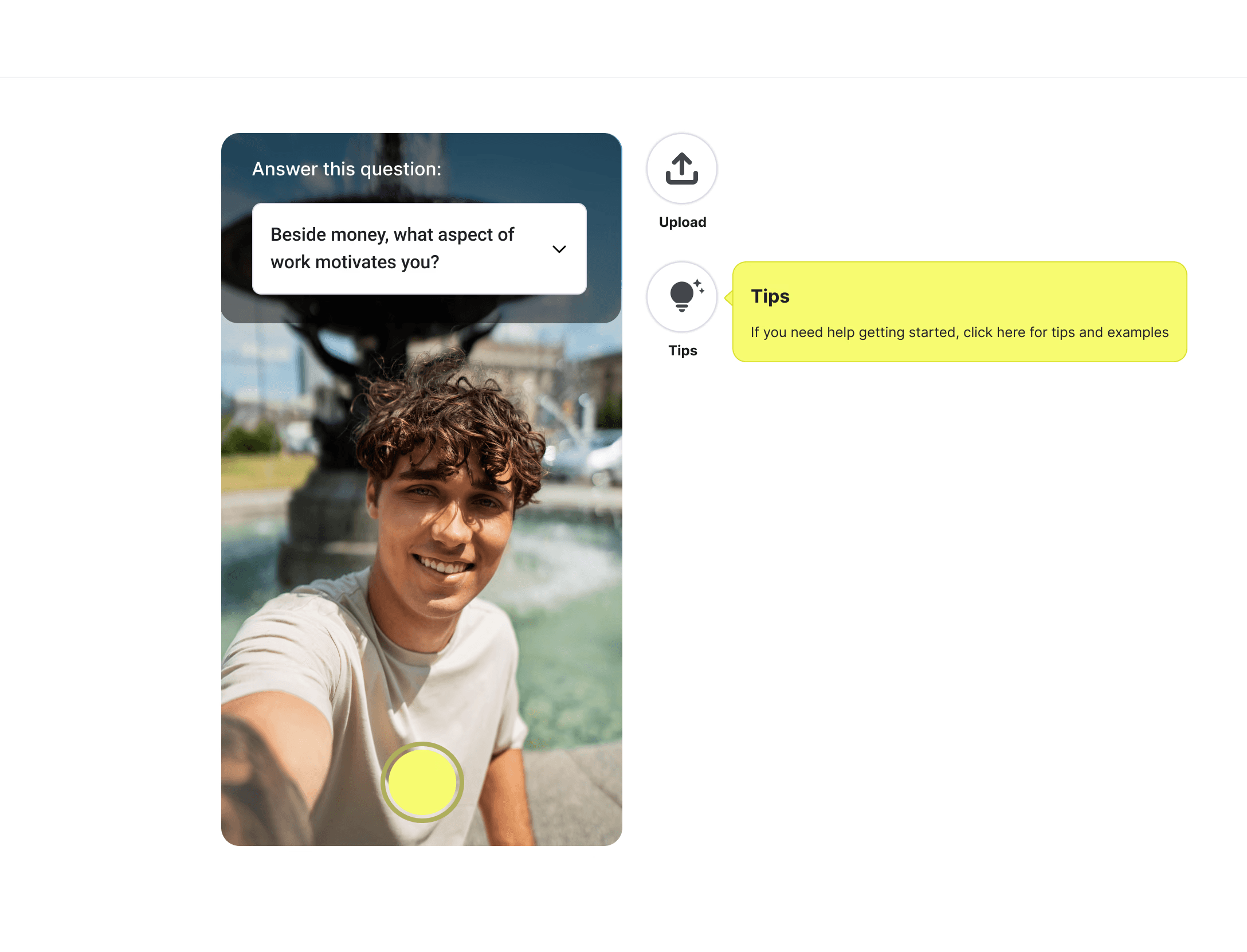
Tested 3 control layouts
Shipped the mobile-overlay (Version C) because it matched users’ camera mental model and scaled cleanly to mobile.
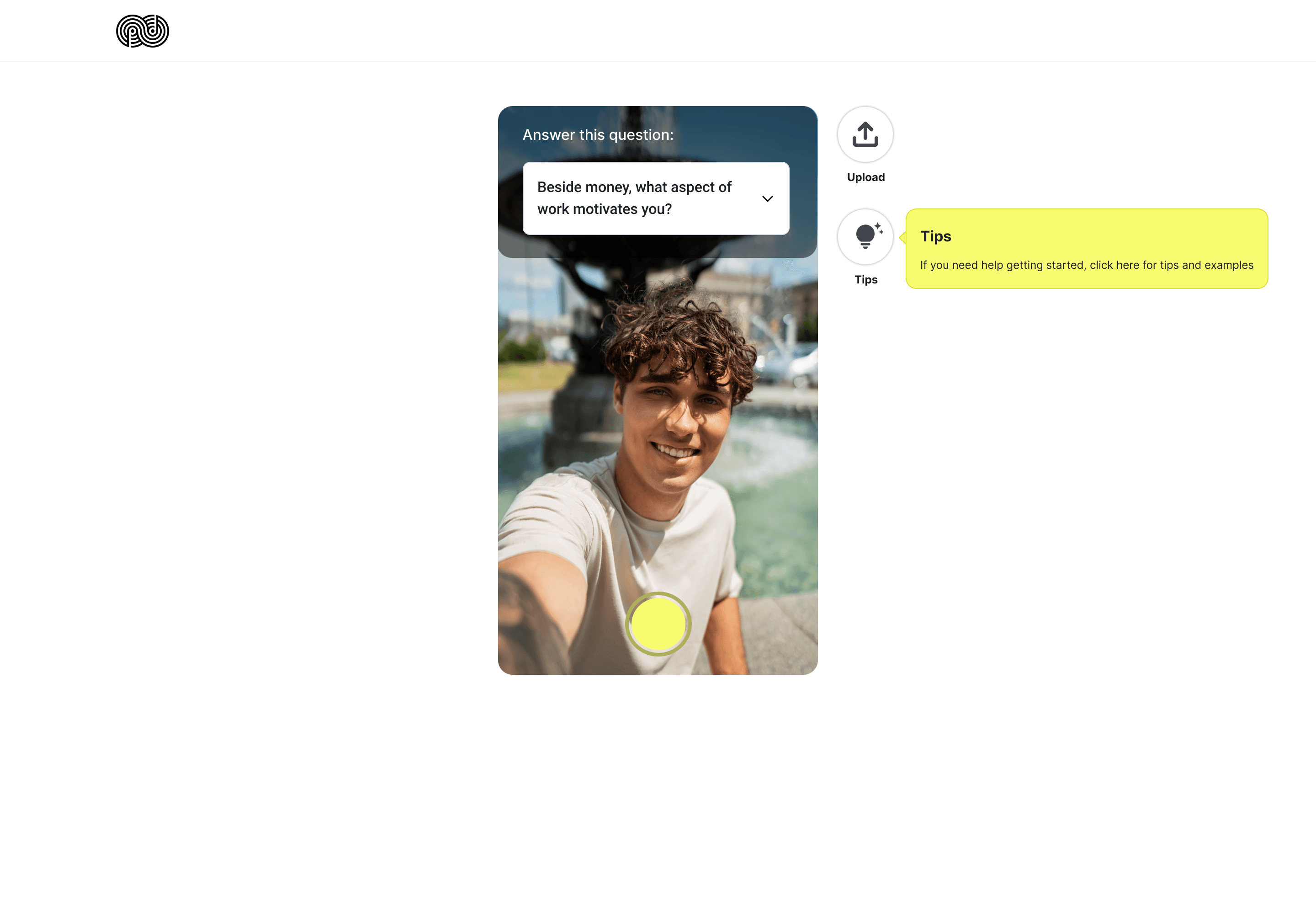
Version C (Shipped)
All UI inside the video frame (familiar mobile pattern)

Version C (Shipped)
All UI inside the video frame (familiar mobile pattern)
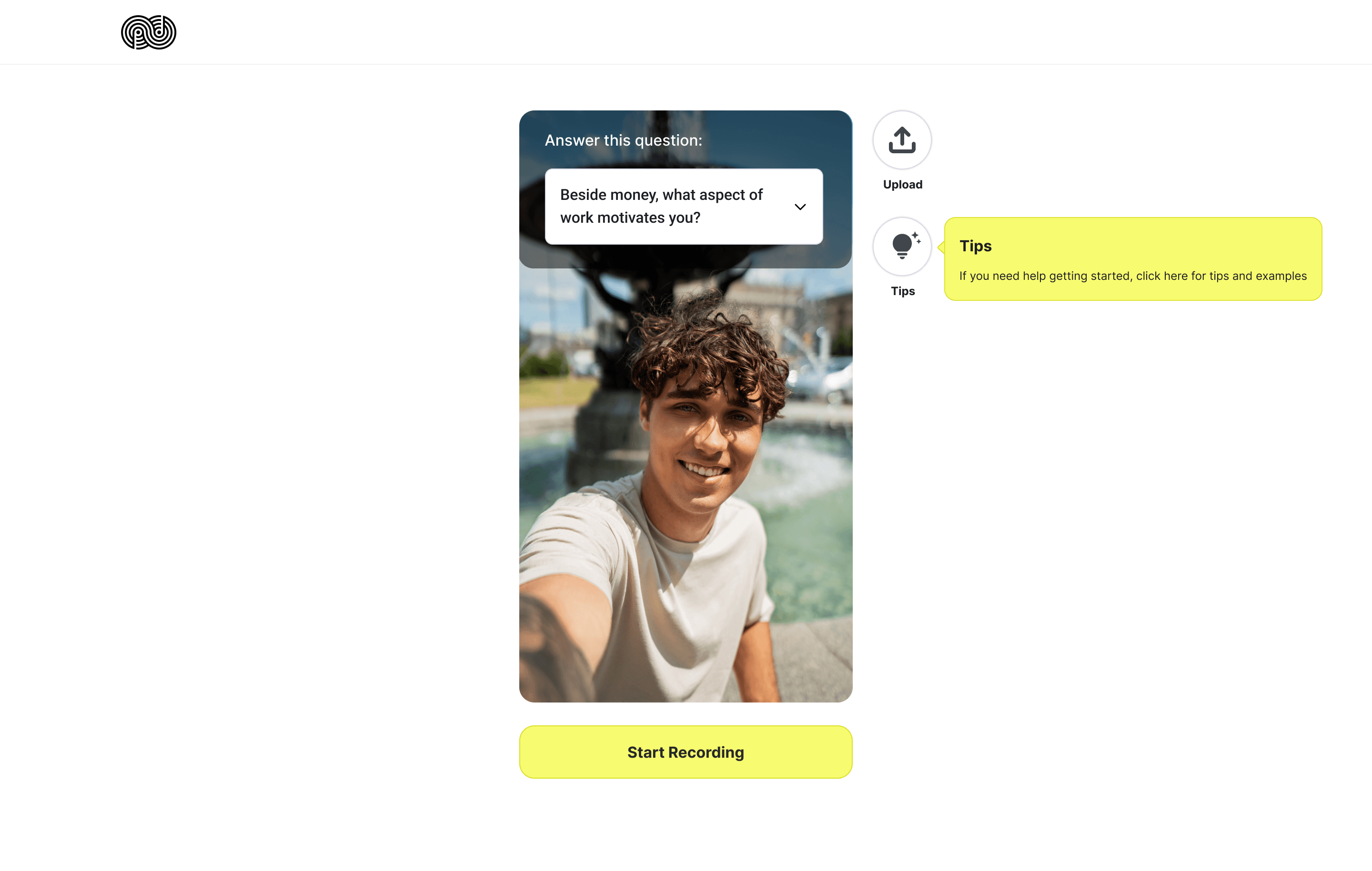
Version A (Hybrid)
Prompts inside, controls outside (split user focus)

Version A (Hybrid)
Prompts inside, controls outside (split user focus)
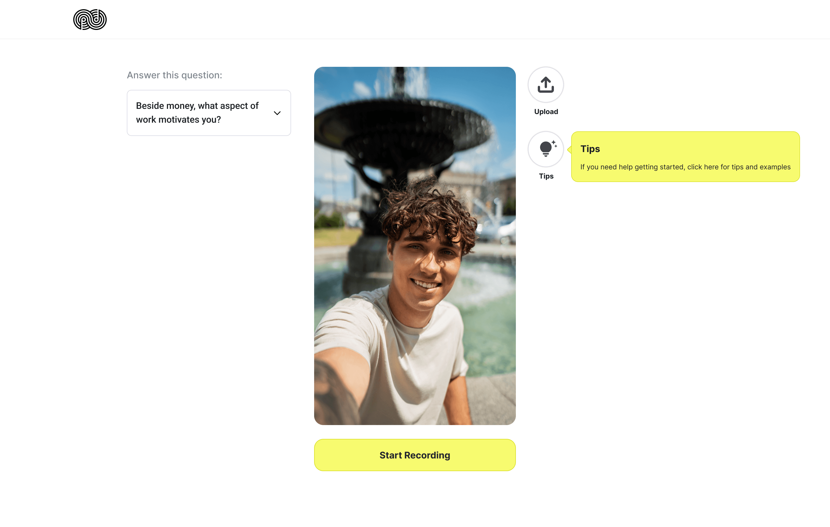
Version B (External)
All UI outside and controls outside for users to focus on recording

Version B (External)
All UI outside and controls outside for users to focus on recording
Review & Redo
After recording, users could:
Watch their full video
Redo it as many times as they wanted (no limit)
Feel confident before moving forward
This step is critical because it shifts power to the user. We are not forcing them to submit something they're uncomfortable with.
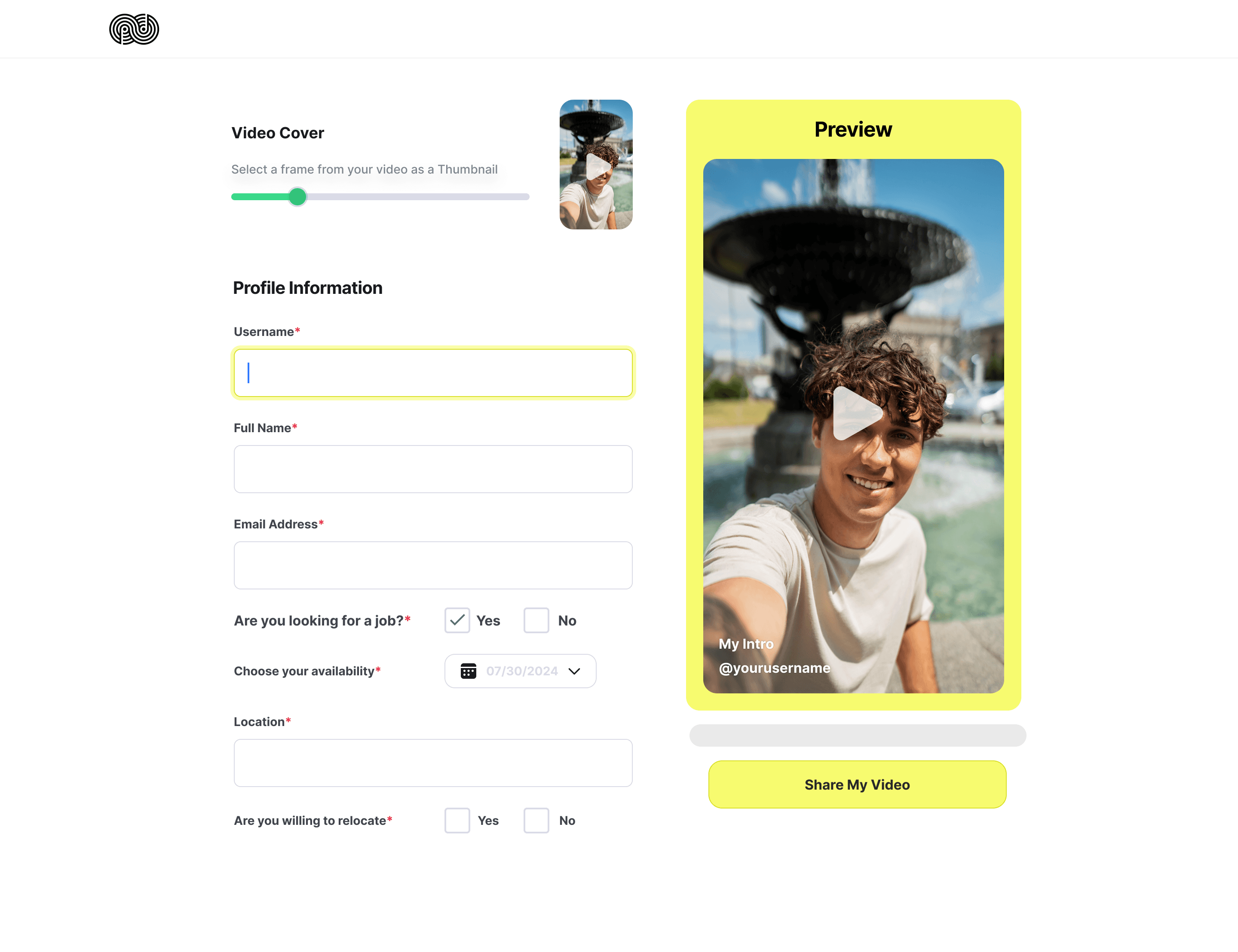
Sign-Up + Profile Setup
After they approved their video, they filled out:
Basic info (name, location, role interest)
A few profile questions
These questions were short and scannable. The goal was capturing just enough to build their profile, not exhausting them.
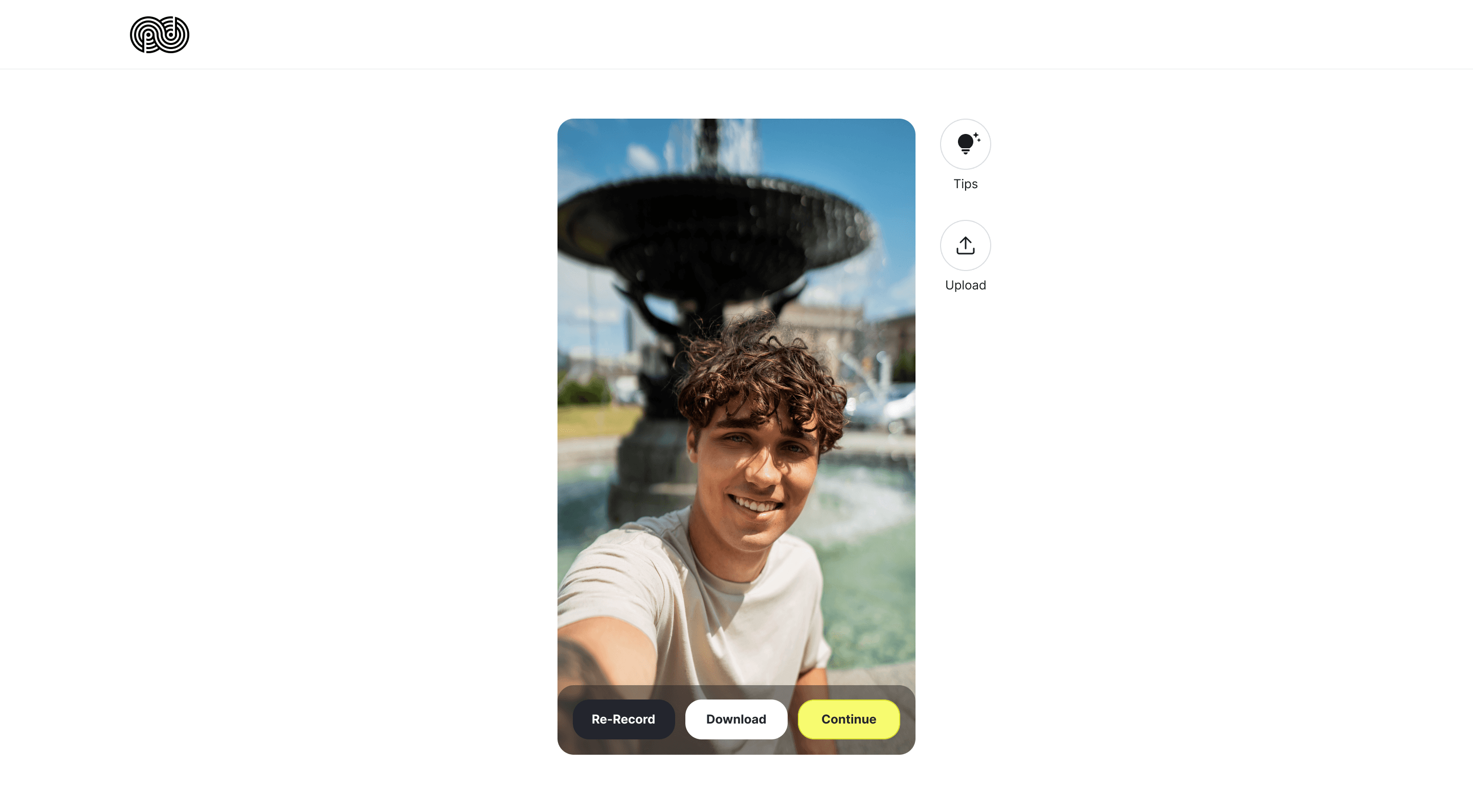

Review & Redo
What if I don't like it? Can I try again?
After recording, users could:
Watch their full video
Redo it as many times as they wanted (no limit)
Feel confident before moving forward
This step is critical because it shifts power to the user. We are not forcing them to submit something they're uncomfortable with.

Sign-Up + Profile Setup
Now what? What else do they need from me?
After they approved their video, they filled out:
Basic info (name, location, role interest)
A few profile questions
These questions were short and scannable. The goal was capturing just enough to build their profile, not exhausting them.
The Constraint
Speed Over Research
I had 2 weeks to ship, which meant no time for user testing. To mitigate risk without data, I:
Aligned on Empathy: Asked the founder "Where do you see users get stuck?" to identify anxiety points.
Aligned on Empathy: Asked the founder "Where do you see users get stuck?" to identify anxiety points.
Relied on conventions: Used familiar patterns (like the mobile-style recording UI) to reduce the need for learning.
Relied on conventions: Used familiar patterns (like the mobile-style recording UI) to reduce the need for learning.
Built for Iteration: Designed the flow knowing we would refine it after launch based on real user behavior.
Built for Iteration: Designed the flow knowing we would refine it after launch based on real user behavior.
The sign-up met the CEO's requirements and surfaced a deeper activation problem, leading to a return engagement in 2025 to redesign the full onboarding.
The sign-up met the CEO's requirements and surfaced a deeper activation problem, leading to a return engagement in 2025 to redesign the full onboarding.
The sign-up met the CEO's requirements and surfaced a deeper activation problem, leading to a return engagement in 2025 to redesign the full onboarding.
What I Learned
3 lessons through shipping
[01]
Pharmacy side
Add onboarding guidance
Product templates for common medicines
Real analytics dashboard focused on operator questions
[03]
Integration
SMS tied to order lifecycle (not just a tool)
Multi-location support for larger pharmacy chains
[02]
Consumer side
Run research with both operators and patients
Test which discovery method converts better: pharmacies-first vs. category-first
Add trust signals: pharmacy verification, delivery times, ratings
Build the prescription ordering flow (I only hinted at it)
[01]
Confidence > Features
User anxiety is the biggest blocker in complex flows
Solving for fear (with guidance and redos) mattered more than adding more recording features.
[02]
Alignment Prevents Rework
Spending Week 1 aligning on the founder’s goals meant zero major revisions later.
We shipped in 2 weeks because we agreed on "good enough" early.
[03]
Ship to Learn
Shipping something thoughtful teaches you what to build next.
A year later, the company used those learnings to pivot and hired me back to redesign the post-registration experience based on this foundation.
[
WORKS
]

